You may know your products or services well and be able to navigate your company’s website with ease, but can your customers and prospects say the same? Can they always find exactly what they need when they arrive on your site? Website design and user experience (UX) tactics work together to ensure that they do. As a byproduct of this, certain website design tricks can boost website sales too.
In this article, I’ll explore what UX really means in website design and cover some user experience tricks that will help you level up your website so that it improves sales and strengthens your brand as a whole.
What is UX in Web Design?
UX is all about ensuring each encounter that a prospect or client has with your brand is enjoyable or friction-free. It’s not unique to or isolated to marketing. For instance, your product designers should consider how people engage with your products as they’re being developed or enhanced. Likewise, your customer service team should understand the types of assistance people routinely require and put solutions within reach. At times, these groups may work together as well. For instance, if customers often ask how to use a specific product feature repeatedly, the product designers can make enhancements to eliminate the issue. When it comes to UX in web design, the concern is that your website visitors can complete the actions they intended to when arriving on your site as quickly and easily as possible. In some cases, that means providing basic information, like hours or availability. It might also mean empowering customers to learn about your products, get help with your products or services as needed, or complete other tasks.
UX Design vs. UI Design
UX design is often used interchangeably with user interface (UI) design or usability, but they reference different things. UX relates to the components of a product, including design, function, usability, and branding. UI is a component of it and relates to the visual elements that users interact with, such as buttons, icons, and screens. In this sense, a UI issue is always a UX issue, but a UX issue is not always a UI issue.
Why is UX in Web Design Important?
Let’s say you create a website that feels so intuitive users always know exactly how to get the information they need with a single click. The UI is fantastic. However, the site loads very slowly, and people leave before they ever discover how intuitive it is to use or get the information they want. The UX is terrible. You must deliver a great experience on all fronts to keep visitors engaged and ultimately boost sales. In this sense, “user experience tricks” aren’t so much “tricks” as they are best practices to achieve those goals. UX investments can produce $100 for each $1 invested, according to TrueList. Their research also shows that nine in ten users won’t return to a site if the UX is bad and that 70 percent of online business fall-throughs are tied to bad UX. In other words, perfecting your website UX is one of the single most important things you can do for the overall health of your business.
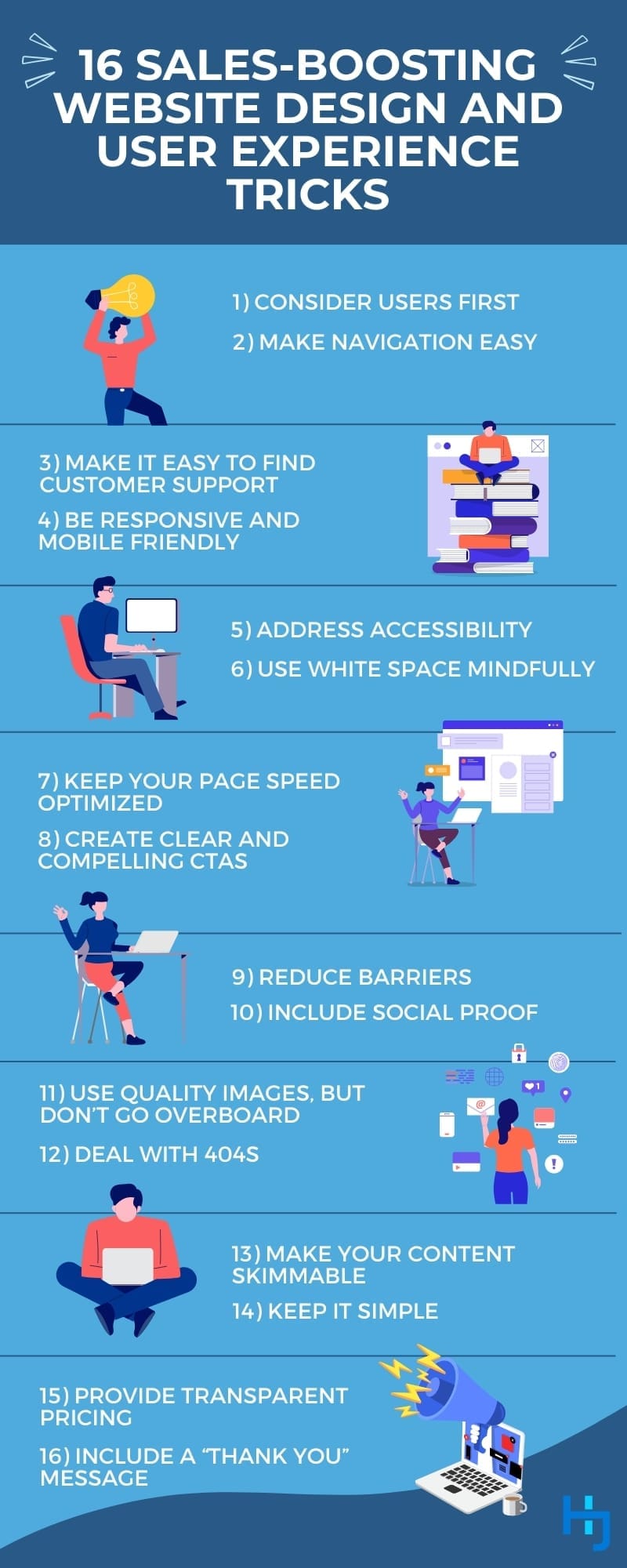
16 Website Design and User Experience Tricks
Now that we’ve covered some background on UX, let’s explore some user experience tips that will help you meet the expectations of your visitors.
1. Consider Users First
The most important of all website design tips is to keep the user’s concerns top of mind. If you haven’t created a website for your business yet, this typically means reviewing top websites first and attempting to emulate their designs with yours. This is not the time to be radical or set yourself apart from the pack and expect people to adapt. They won’t. People crave consistency. In psychology, there’s a concept known as “consistency theory.” It basically states that people are motivated to seek out coherent or consistent experiences, thoughts, behaviors, etc. “No website is seen in isolation,” explains Jakob Nielson, an authority on UX who has dedicated decades to research. “Users come to your site expecting things to work the same way they are already used to.” In other words, the biggest thing you can do to improve user experience is to make your site function like the websites your visitors already use. Individual pages on your site should look and function similarly to one another as well. Following this, you can monitor website data to identify which actions people intend to take when landing on your website and explore ways to minimize the number of clicks to help them accomplish the task. Because you and your team likely already know your website and products well, you may also want to invite users to test your site or use surveys and other data-gathering methods to determine what others with reduced familiarity experience.
2. Make Navigation Easy
One of the most important aspects of UX for websites is the navigation bar. This is another area where consistency theory comes into play. If the navigation menu doesn’t function like others that people are accustomed to using or it isn’t organized in a common way, people will give up and leave the site.
3. Make it Easy to Find Customer Support
While the probability of selling to a new customer maxes out at around 20 percent, the likelihood of selling to an existing customer climbs as high as 70 percent, according to SEMrush. Because of this, more than two-thirds of a typical company’s revenue comes from existing customers, Small Biz Genius reports. Businesses concerned about boosting sales must also focus on customer stickiness. A big part of keeping existing customers close is providing adequate support, so proper UX web design must address it. Depending on the nature of your business, this may mean offering basic contact information and online forms to request support. Others may benefit more from chatbots, user guides, or live support. Whatever your business offers, however, website visitors must be able to find the information quickly and effortlessly engage with customer support tools.
4. Be Responsive and Mobile Friendly
More than half of all traffic now comes from mobile devices, according to Google. If you’re trying to improve a website, make sure the needs of mobile users are met too. For instance, the site should scale and display well on any device without sacrificing usability or access to information. A few other traits of mobile-friendly sites include:
- Simple menus
- Large text
- Large buttons
- Mobile-friendly forms
5. Address Accessibility
Just like your website’s visitors will arrive on different devices, they’ll arrive with varying abilities and assistive technologies too. For instance, five to ten percent of the population experiences color blindness, CNBC reports. While some only see in black and white, others have trouble distinguishing between certain colors, such as red and green. Accessible web UX design takes this into account and avoids these color combinations, especially where site navigation is concerned. Ensuring text stands out from the background enough to ensure it’s legible is another concern. It’s also worth noting that many people with visual impairments or learning disabilities use screen readers, a special type of assistive technology that reads web content out loud to site visitors. As a result, web designers must be mindful of using semantic HTML that breaks the content up in a sensible way for easier navigation. Images should also be accurately described in alt image tags to ensure those using screen readers don’t miss crucial information encoded in images. If a person can’t use your site or read your content because it’s not accessible, they’re going to leave quickly. Make accessibility a priority.
6. Use White Space Mindfully
White space refers to the empty or unused space around elements on a website, such as buttons, pictures, titles, and paragraphs. Businesses often view white space as unused real estate that should be used to promote the brand, but the spacing serves several valuable purposes, researchers at San Jose State University say. Effective use of white space can:
- Provide distinction between elements to help key information stand out and boost recall.
- Improve perceived ease of use.
- Strengthen credibility and trust.
- Create a feeling of luxury.
- Impact price perception when used around images on e-commerce sites.
There’s also a correlation between conversions and the number of elements on a page, Google researchers say. For instance, if the number of elements climbs from 400 to 6,000 on a page, the probability of conversion drops 95 percent. Choose which elements to include wisely and leave ample space between them to improve the user experience.
7. Keep Your Page Speed Optimized
One of the biggest areas for website improvement is page speed. Nobody wants to sit around and wait for a site to load, and people are hyper-aware as the seconds tick by. For example, as page load time goes from one to three seconds, a mobile user is 32 percent more likely to “bounce,” according to Google. That means they leave the site without taking any action. If a page takes ten seconds to load, the probability of a bounce skyrockets by 123 percent.
8. Create Clear and Compelling CTAs
A CTA, short for call-to-action, gives your website visitors their next step. This can be something like a final paragraph at the end of a blog that invites the reader to engage with you in another way, though the term is used more often in relation to buttons on a website. A few ways to increase the effectiveness of a CTA are covered below.
Use a high-contrast color.
All CTAs should stand out from the content around them.
Differentiate between primary and secondary CTAs.
Your primary CTA should stand out more from the others. For instance, if the main goal of a page is to encourage visitors to request a quote, that would be your primary CTA. You might make that button a bold red color and lesser CTAs, such as subscribing to a newsletter, a light blue.
Include a verb.
CTAs are action-oriented, so they need words like “Go,” “Try,” “See,” and “Get” to encourage interaction.
Experiment.
Use A/B testing to explore whether using different words or colors increases clicks.
9. Reduce Barriers
Good UX in web design means the visitor can complete whatever action they came to do as quickly and easily as possible. It’s a simple concept, but businesses often undermine this guideline with common marketing tactics. In e-commerce website design, for example, the checkout process should be fast. Each action a person must complete before they pay creates friction. Yet, many e-commerce sites force visitors to create an account prior to checkout. It’s an unnecessary step that costs the business sales. Businesses also use pop-ups in an effort to guide visitors into taking specific action. Pop-ups aren’t always a bad thing, but they are when they’re designed poorly or interrupt the user’s flow. For instance, if the person just arrived on a page and began reading it, a pop-up inviting them to divert their attention elsewhere is intrusive. Gated content, or content that a user cannot access without completing a form, can be problematic too. While this is done to generate leads, businesses often receive fewer leads from gated content than they would have if they’d made the content openly available. The divide is greater with top-of-funnel content and with content of questionable value – after all, the visitor has to trust that you’re going to provide them with something useful enough that it’s worth their effort to jump through hoops and that they can trust you with their information. That’s not to say that you can never use these techniques or that there aren’t ways to make them more user-friendly. However, brands should be especially mindful that they’re creating barriers that ultimately hurt UX and can damage sales.
10. Include Social Proof
More than 75 percent of consumers say they “always” or “regularly” read online reviews for local businesses, according to Bright Local surveys. This represents a 17 percent increase from just two years prior. People seek out the opinions of others and trust them as much as recommendations from family and friends. This is known as social proof. Some additional examples of it include:
- Embedded reviews from other sites
- Customer testimonials
- Endorsements from experts or authorities
- Business credentials
Social proof gives visitors subconscious signals that your business is trustworthy, so your sales increase. When you include social proof on your site, it also gives people what they want to see right there, so they don’t have to leave your site to find it.
11. Use Quality Images, But Don’t Go Overboard
Most people know that images are among the best website design tricks to leverage. They instantly convey what might otherwise take an entire page of words to express and can evoke emotion in ways words cannot. However, there are a few caveats to this. First, not just any image will do. The image must add value to the content, not just look nice. Consumers are also now savvy enough to spot stock photography from a mile away and prefer authentic or original work. Simply swapping out stock photos for images of real team members and equipment can produce a 45 percent boost in conversions, per VWO research. Secondly, website design UX best practices must be kept in mind. For example, excessive use of images will slow down a site and can affect accessibility. Although there’s no ideal number of images to include, as some topics require more than others and image size has an impact, too, striking a good balance is essential.
12. Deal With 404s
When the file or page a visitor is trying to access no longer exists on your site or has moved, or the user typed the URL wrong, they’ll land on the site’s 404 error page. Getting a 404 error is irritating for visitors, which also means it’s a concern for SEO and can reduce the amount of traffic a site receives. Naturally, the best way to deal with 404s is to avoid them in the first place. Keep links up to date and use redirects when content moves or is taken down. The site should also be periodically checked for broken links. Google Search Console can help you stay on top of 404 errors, or you can use a specialized tool to search for them on a recurring basis. Issues may still creep up despite these measures. Having a well-developed 404 page will help. A good 404 page will usually include tools such as a search bar or navigation menu to help the visitor get back on track. Many sites also link to their most popular content. This approach is beneficial for SEO, especially if the links include keywords, because it demonstrates those pages are important and can help them rank better. Lastly, some sites diffuse the situation with humor or an option to report the 404 page. Although it’s not a fix, it can lighten the mood enough to keep someone on the site rather than bouncing.
13. Make Your Content Skimmable
People don’t sit down and read full pages. Instead, they scan a page for relevant information, read bits of an article, and then decide if they want to invest the time required to read it. If they’re met with a sea of text, they’ll leave the page without reading anything. The more you break up the content in ways people can digest quickly and easily, the longer they’ll stay and the more likely they’ll be to take the next action. A few ways to make content more skimmable are covered below.
Using headers to make the hierarchy of a page clear.
Headings work very similarly to the way notes are taken. The main points of the page receive H2 headers. Topics that relate to each H2 are grouped under, each with H3 headers if the content warrants it. H4 and H5 headers can be included below the H3 headers as well.
Make the headings descriptive or create summaries of the points with them.
Summary-style headings ensure readers can walk away knowing the gist of the page even if they don’t read it all. They also make it easier for readers to quickly identify if they want to read each individual section.
Include a table of contents at the top of the page.
Readers will appreciate seeing a high-level overview before they commit to reading and can use the table to jump to content that interests them.
Use bullet points to segment information.
Bullets make it easier for people to identify the main points without really reading.
Format text mindfully and consistently.
Visual cues help readers understand how to engage with content quickly. For instance, all your links should be formatted the same way. To ensure readers can identify links quickly, no other text should have the same colors or distinct markings. Bold text can also be used sparingly. It works best when you’re summarizing information at the start of a paragraph or bullet point. When it’s woven throughout the text instead, readers have difficulty focusing and don’t know which parts are important.
14. Keep it Simple
Try not to get carried away with website enhancements. The flashier or fancier a website is, the harder it usually is to navigate and the longer it takes to load. These things kill the user experience, so simpler is always better.
15. Provide Transparent Pricing
Many businesses, even e-commerce sites, intentionally obfuscate pricing in an effort to get leads to contact them. In reality, it often has the opposite effect. Prospects want to know whether your products or services are within their budget or, at the very least, want some idea of how your offerings compare to others. If they can’t find that out through your website, they’ll move on to the next site that offers pricing. There are a few exceptions to this. For instance, professional service providers such as lawyers, accountants, and consultants rarely offer pricing because the services are tailored to the needs of the customer. Staffing and security firms often cannot provide clear pricing because the needs of the client vary. Outside of these few rare exceptions, most businesses should include some kind of pricing information.
16. Include a “Thank You” Message
If someone interacts with your business, be it to request a demo, sign up for a newsletter, make a purchase, or something else, always show some type of gratitude. It’s basic customer service and also shows them that the action they’ve taken or the request they’ve made is being addressed.
Get Help Implementing the Best Website Design and User Experience Strategy
A brand’s website is the heart of its digital marketing. All other activities feed into it or rely upon it. Because of this, the UX must be as seamless as possible. This is why I consider the website to be “ground fruit” that must be addressed as one of the first digital marketing initiatives. If you want help delivering a solid experience on your website or have questions about digital marketing, please contact me for a complimentary consultation.


Husam Jandal
Husam Jandal is an internationally renowned business and marketing consultant and public speaker with a background that includes training Google Partners, teaching e-business at a master’s level, receiving multiple Web Marketing Association Awards, and earning a plethora of rave reviews from businesses of all sizes.
